
This advertisement was placed in distribution during the month of September 2021. The creator had the right idea using vibrant colors that catch the eye, but the colors are not coordinating, and are almost too vibrant. This flyer has a lot of information on it, enough to be split into two placed on a circulating loop in conjunction with one another. Using that strategy, the information would be distributed wider.
When this flyer got distributed, it was mainly a social media campaign, and the audience was family and friends of the team, who were primarily out of state, or were signed up to help set up for the event. This flyer should’ve gotten into the hands of those who were local to Chittenango, and far enough in advance that people would be able to plan lunch to get chicken barbeque.
As you may have been able to derive from the ad, I created this for a small robotics team I was a part of in high school. Although it may not be A+ marketing skills, small ads like these are what got me interested and intrigued in marketing. I’ve also redone these ads below to what I, now with a little bit of marketing experience, and the help of Canva, wanted them to be.
We also may have overwhelmed people trying to host 3 events in one, and while trying to advertise for all, only partially advertised for each.
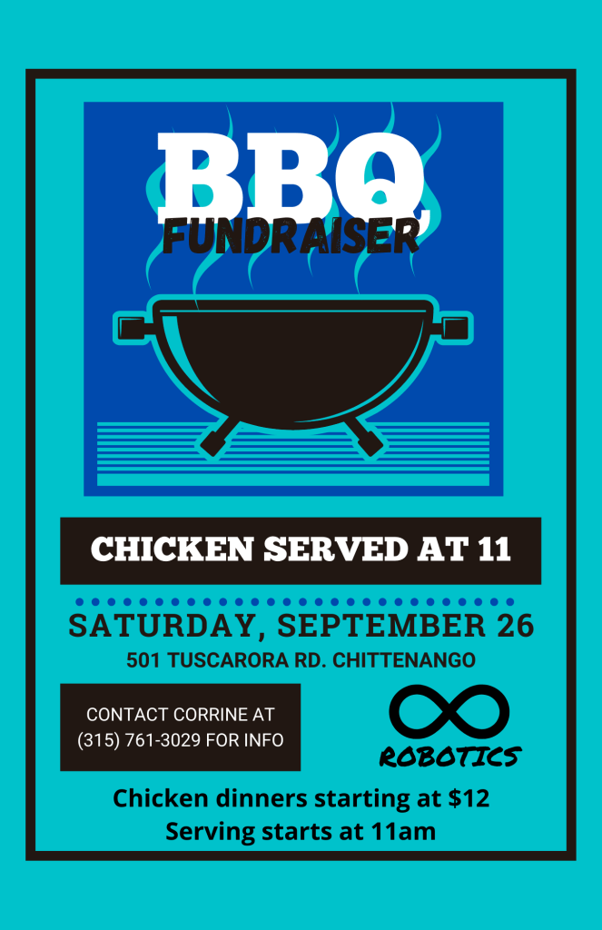
The revised version of this flyer is only advertising the Chicken lunch. There are only four colors, two of which are a neutral tone, black and white. The team’s colors are mainly a teal, with hints of dark blue. This flyer should have been placed on facebook groups, newspapers, and at a big community event. It needs to get into the hands of the families in the Chittenango, Canastota, and Fayetteville areas. The cans and bottles event should have been advertised separately, revisions below.
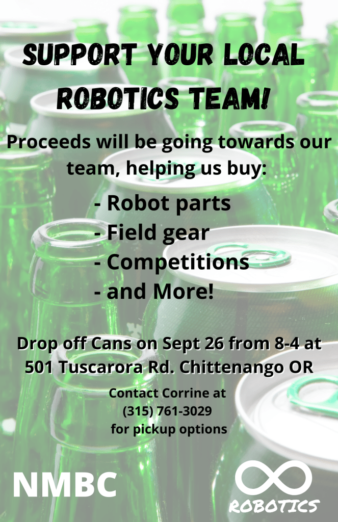
The distribution method for this flyer may not be as effective online, but door-to-door in the local community. The timeline for this should be at least a month in advance, so people can start collecting cans and bottles with the robotics team in mind. Door to door means protecting your flyers from weather, so maybe a doorhandle bag with a small fridge magnet, encouraging families to pin it to their fridge as a reminder. I only used black and white colors for text colors, as the background picture is busy, and even though I adjusted the opacity, but not too much that viewers lose what the picture is.
With the introduction of these flyers, I would then revamp the original flyer to only advertise the yard sale, which ended up being our bigest fundraiser of the three. I would probably keep the white background, as we could increase the amount of print flyers, and even make bigger flyers for roadside advertising. Looking into 2022, I will probably plan to use these flyers if we choose to do these events again.
